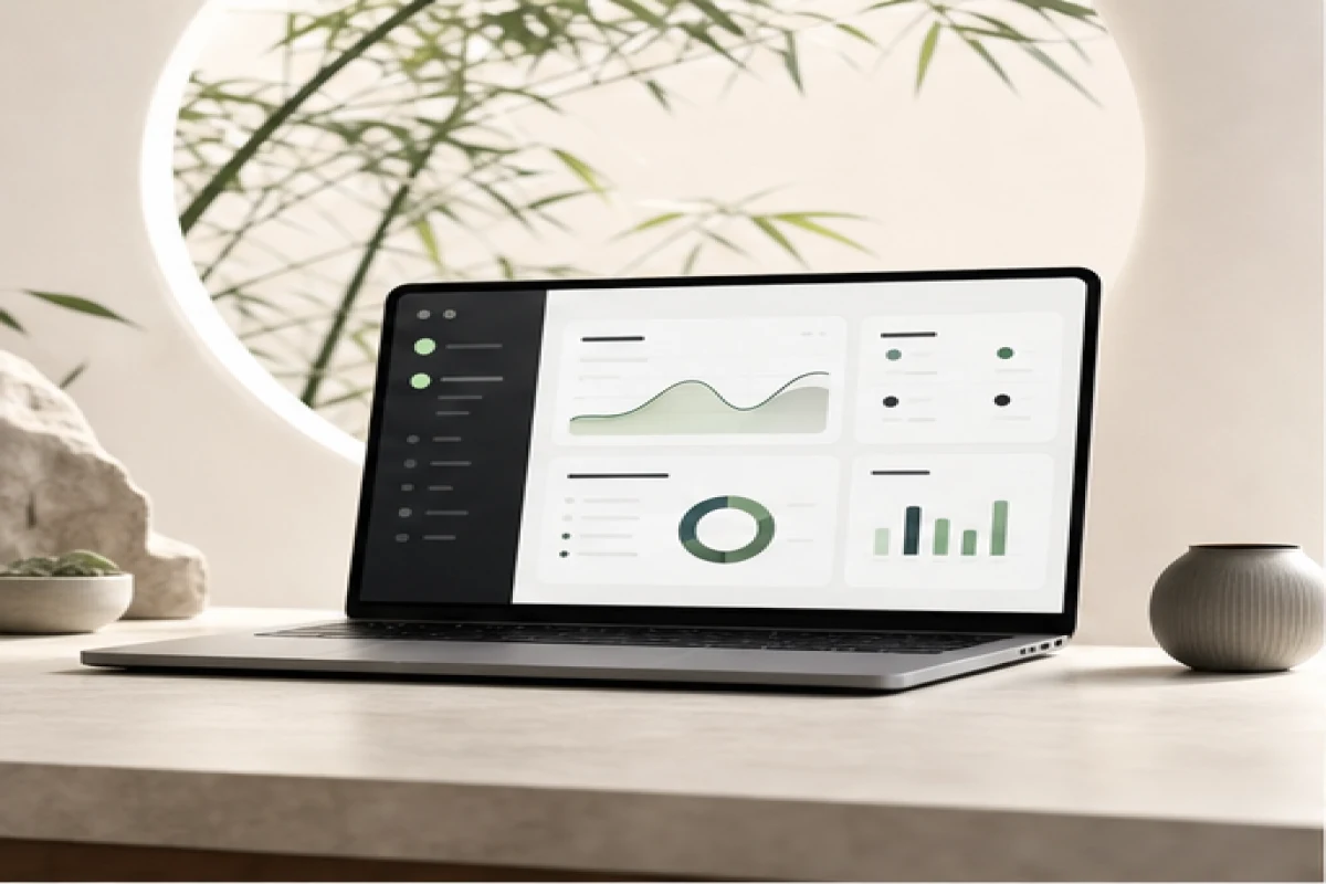
Good design is invisible - confusing design isn't
Most usability problems never get reported. A user doesn't complain about a confusing dashboard - they just stop using the feature, or worse, stop using the product. UX research and proper design surface that friction before it quietly costs you users, and turn it into a clear, navigable journey instead of a guess at what "looks modern."
What changes
UX research, user journey design and wireframing, turned into the dashboard design, mobile app UI and SaaS UI that real users - not just stakeholders in a review meeting - find easy to act on.
What changes - by stage
Research & journey mapping
UX research and user journey design that find out where real users hesitate, get lost, or abandon a flow - before a single screen gets designed based on assumptions.
Wireframing & prototyping
Wireframing and prototype design that test a flow's logic cheaply, before development time gets spent building something that needs to be redesigned later.
Dashboard & SaaS interfacesDashboard design and SaaS UI design built for users who'll open the product daily - where clarity and speed of action matter more than visual flourish.
Mobile interfaces
Mobile app UI designed for thumb-reach, smaller attention spans and the interruptions that come with using a phone, not a scaled-down desktop layout.
Design systems
Design systems that keep every screen, button and interaction consistent as a product grows past its first few features - so design doesn't have to be re-decided every sprint.
